Welcome to a critical Superbadge in the Agentforce series where we create and edit dashboards that help companies determine their AI readiness.
In this four part challenge the company we’ll be using as a use case is Cloud Kicks a rapidly growing sneaker company. Cloud Kicks wants to use Agentforce to simplify work and reduce manual tasks to free up employees to focus on higher value areas.
So how can Cloud Kicks stand out in the marketplace by using Agentforce and how can the team visualize the impacts in dashboards that visualize insights across teams.
Here’s the link to the Superbadge trail Dashboard Insights for Agentforce Readiness: https://trailhead.salesforce.com/content/learn/superbadges/dashboard_insights_for_agentforce_readiness_superbadge_unit
Step I: Obtain a Developer Edition org to complete the exercises
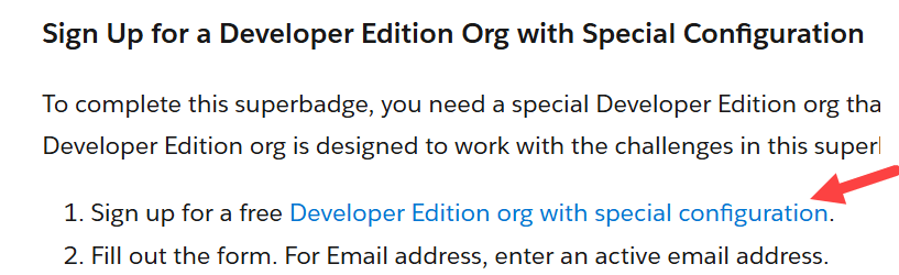
Click on the link provided in the Superbadge to obtain your developer org that has the Coral Cloud Resorts instance pre-populated.
You will receive an email to verify your account. Once that’s all set up…
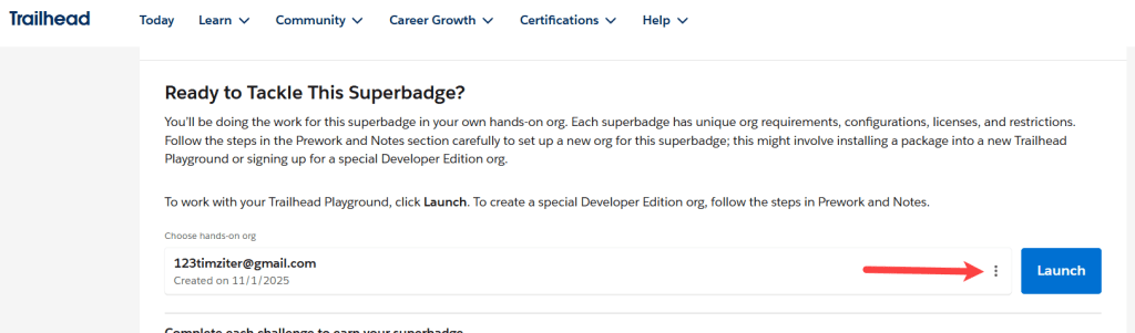
Refresh the screen and your new org should appear at the bottom of this superbadge. If it doesn’t that’s ok. Click on the three dots next to the Launch button.

Click on Connect Org and you’ll be asked to log into your new org. Once you are logged in come back to the Superbadge page a click the Launch button.
Step II: Update the Cases Without Owners dashboard section

(1) In the 9 dots in the upper left navigate to the Agentforce Readiness app.
(2) Click on the Dashboards tab.
(3) Click on All Dashboards on the left.
(4) Select the dashboard Data Quality Analysis.

Click on the Edit button.

(1) Navigate down to the Cases Without Owners tile.
(2) Select the pencil icon to edit.

Select the Gauge chart.
Now we want to modify this chart to show three ranges:
1.) At Zero
2.) 1-3
3.) and 4 plus

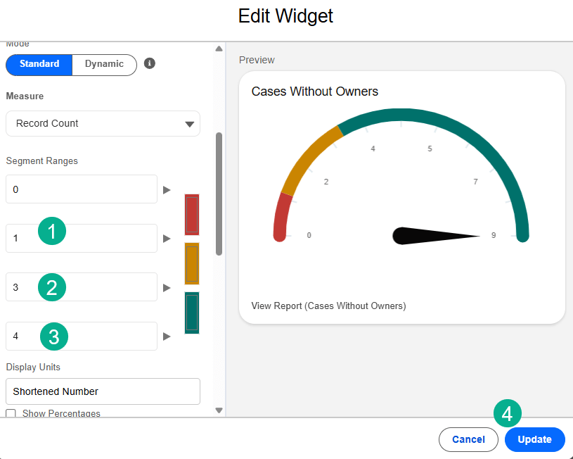
Scroll down to the Segment ranges.
(1) Change the 2nd input area to 1.
(2) Change the 3rd input area to 3.
(3) Change the 4th input area to 4.
(4) Click Update.

The updated dashboard element should look like above showing those three scenarios.
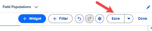
Save the dashboard.
Step II: Add the Case Field Population report to the dashboard
We need to add a new dashboard element from a report.

(1) Click on the Widget icon in the upper right.
(2) Select Chart or Table.

(1) Under Reports select All Reports.
(2) Select Case Field Population.
(3) Click on Select.
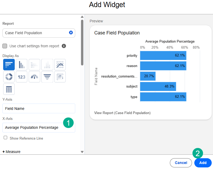
(1) Under X-Axis select in the drop down: Average Population Percentage.
(2) Select Add.

The tile will appear under the Cases Without Owners tile. Move it to the right for optimal placement.
Save your dashboard.
Step III: Update the Opportunity Data Quality section

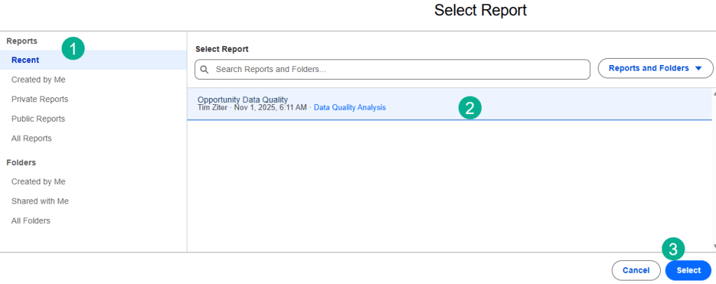
(1) We need to update the Opportunity Data Quality report. Navigate to the Reports tab.
(2) Select All Reports.
(3) Select the Opportunity Data Quality report.
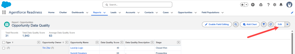
Select Edit to modify the report.

(1) Under the columns section, select Data Quality Score.
(2) Un-check the Sum Box.
(3) Select Apply.

Remove the Type and Opportunity Owner field under Group Rows.
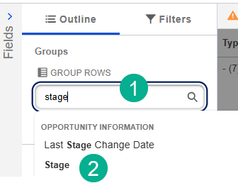
(1) Search for Stage.
(2) Select Stage.

(1) Search for Close Date.
(2) Select Close Date.
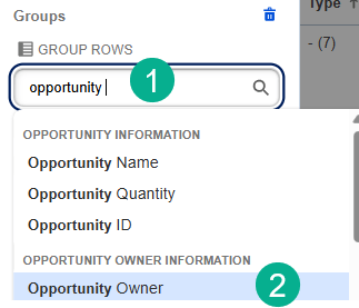
(1) Search for Opportunity.
(2) Select Opportunity Owner.
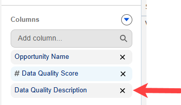
Remove the Data Quality Description Column.

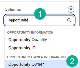
(1) Search for Opportunity Owner to add that column.
(2) Select Opportunity Owner.

Now we can see the data is looking a bit more as expected.
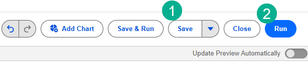
(1) Select Save.
(2) And Run.
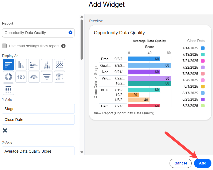
Click Add as nothing needs to be updated on this widget.
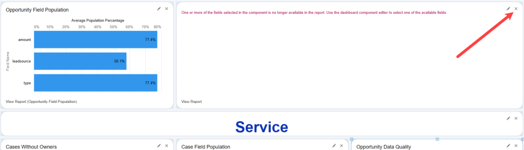
Right above the Service section of the dashboard you’ll want to remove a widget by clicking on the x.
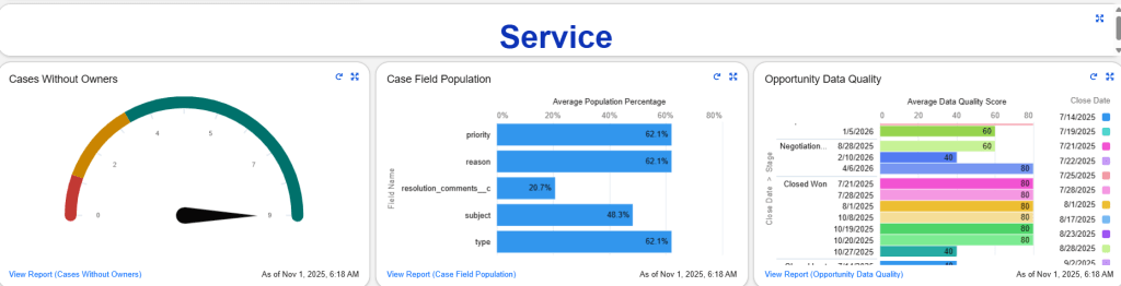
Save and refresh your dashboard and it should look like this:
Now let’s check to see if we have completed this challenge.

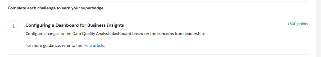
Looks good. Next up is Exercise II: Design Analytics for Visibility and Usability
Have a great Agentic Journey
